As part of my journey into business analytics, I recently created an interactive sales dashboard in Excel for Bairaha Farms PLC.

Bairaha Farms PLC is one of Sri Lanka’s leading poultry producers, well-known for its contribution to the nation’s food industry. The company is engaged in poultry breeding, processing, and distribution, delivering fresh chicken and related products to supermarkets and households across the country.
What My Dashboard Shows
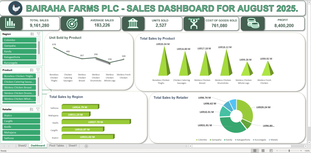
This dashboard focuses on sales data for August 2025, bringing the raw numbers to life through clean and interactive visuals. It highlights:
- 📌 Units Sold by Product (chicken, sausages, drumsticks, etc.)
- 📊 Total Sales by Region and Distributor
- 💡 Key KPIs such as Sales Revenue, Average Sales, Profit, Total Cost of Goods Sold and Units Sold.
- 📈 Trends and insights to quickly understand sales performance
Here’s a quick preview of the dashboard:
Dashboard Structure and Features
1. Top-Level Metrics

At the top of the dashboard, I designed six key performance indicators (KPIs) that provide a snapshot of Bairaha’s sales performance. These KPIs include total sales, average sales, total units sold, cost of goods sold, and profit. Each metric is presented in a visually uniform card with gray-bordered card with bold numbers and clear icons, ensuring that the information is immediately understandable at a glance.
2. Interactive Filter Panels (Slicers)
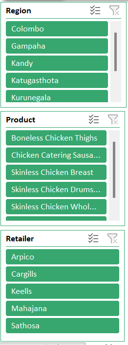
To enhance interactivity, I added three filter panels on the left side of the dashboard that allow users to drill down into specific data. Users can filter the information by region, product type, or individual retailers. The active filters are highlighted clearly in green, making it easy to focus on specific segments of the data and understand how different factors contribute to overall sales.
3. Data Visualization Charts
The main body of the dashboard is dedicated to four distinct charts that visually represent the sales data.
3.1 Unit Sold by Product
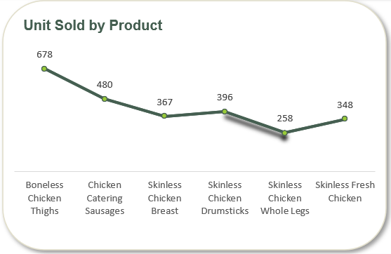
This line chart is designed to track the performance of different products over time. By connecting data points with a line, it makes it easy to visualize trends, allowing a user to quickly see whether the sales of a particular product are increasing, decreasing, or remaining stable. The ability to overlay multiple product lines on a single chart enables a direct comparison of their performance against each other, which is crucial for identifying top-performing or struggling products.
3.2 Total Sales by Product
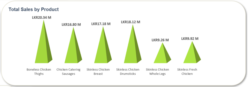
This bar chart provides a simple and effective way to compare the total sales across various product categories. The length of each bar is proportional to the sales value, making it instantly clear which products are the biggest contributors to revenue. The use of a light-to-dark green gradient within the bars, along with the numerical values displayed on top of each bar, adds an extra layer of visual clarity and reinforces the data being presented.
3.3 Total Sales by Region
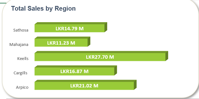
This horizontal bar chart is specifically used to compare sales performance across different geographical regions. By orienting the bars horizontally, it allows for longer region labels without cluttering the visualization. This chart makes it simple to identify which regions are the most profitable, helping to inform regional sales strategies and resource allocation.
3.4 Total Sales by Retailer

The pie chart is an excellent tool for showing a part-to-whole relationship, in this case, the contribution of each retailer to the total sales. The slices of the donut represent a percentage of the whole, giving a clear visual breakdown of each retailer’s impact. The central “hole” in the chart provides a clean space, and the accompanying legend with color-coded circles and retailer names makes it easy to understand which slice corresponds to which retailer.
All charts are enclosed in clean, white-bordered cards with consistent green color schemes to maintain a professional and cohesive look.
4. Why I Built This Dashboard.
Creating this dashboard represents an important first step in my path toward becoming a business analyst. By transforming raw sales figures into clear visual insights, I learned how data can guide business decisions and support operational efficiency. This project also reinforced the importance of interactivity in dashboards, allowing users to explore data on their own and draw insights from trends and comparisons.
Moving forward, I plan to expand my skills by learning Power BI, SQL, and Python, which will enable me to work with more complex datasets and create even more advanced analytics solutions. This project has laid the foundation for my continued growth in the field of business analytics.
5. Resources I Used.
To successfully complete this dashboard, I referred to a combination of official documentation, online tutorials, and personal practice guides. Microsoft Excel’s official documentation provided guidance on charting and formulas, while YouTube tutorials offered practical examples for creating interactive dashboards. I also maintained personal notes and practice files to consolidate my learning and apply it directly to this project.
6. Explore the Dashboard Yourself.
To make this project interactive for readers, I have made my Excel dashboard accessible for direct exploration. By clicking the link, you can filter the data, interact with the charts, and experience the dashboard’s functionality firsthand, just as I do during analysis. This interactive approach allows anyone to understand how sales trends, KPIs, and regional or retailer comparisons come together to inform business decisions.
👉 Click here to view/download the interactive Bairaha Sales Dashboard (Excel File).
✅Stay Connected
I hope you enjoyed exploring my first interactive sales dashboard for Bairaha Farms PLC. If you’re interested in following my journey in business analytics, learning more about dashboard creation, or discussing data-driven insights, feel free to connect with me! You can find me on Linkedin and Instagram for updates, tips, and sneak peeks of upcoming projects.
Stay tuned for my next post, where I will be creating Bairaha’s financial dashboard and sharing more insights from my analytics journey.
